
Modern UX Design in 2026: How Teams Ship Better Products Faster
July 18, 2026
User experience design in 2026 is no longer just about making interfaces look polished. It is about reducing friction, building trust, and helping teams move from ideas to validated products with less waste. As digital products become more crowded, more AI-assisted, and more data-heavy, users expect clarity fast: they want to understand what a product does, why it matters, and how to use it without confusion. That means UX is now tightly linked to business outcomes like conversion, retention, support burden, and speed of delivery.
The teams that consistently ship better products faster are usually not the ones that design in isolation. They are the ones that ground their work in real user problems, validate concepts early, maintain design consistency at scale, and collaborate well across product, engineering, and leadership. Strong UX also helps teams avoid expensive mistakes, especially in complex systems where small usability issues can create outsized confusion. Research-backed design systems, rapid prototyping, and measurable product experiences are now core parts of the modern workflow. Atlassian describes its design system as a collection of guidelines, foundations, tools, and reusable components built to help teams create consistent experiences at speed, while Baymard’s large-scale research continues to show how easily poor UX can damage checkout, search, and product discovery. (atlassian.design)

1. Why UX design matters more than ever in 2026: how user expectations, speed, and trust shape product success
In 2026, UX matters more because the cost of a bad experience is lower for the user and higher for the business. Users have more alternatives than ever, and they are quick to abandon products that feel confusing, slow, or untrustworthy. A polished visual design alone cannot compensate for unclear flows, hidden information, or inconsistent interactions. In many categories, users now expect products to behave like the best products they already use: intuitive, responsive, and transparent.
Speed is part of UX now, not separate from it. People judge a product by how quickly it helps them finish a task, whether that task is making a purchase, reviewing data, filing a request, or getting an answer from an AI assistant. Baymard’s research illustrates how even basic friction can drive measurable abandonment; for example, its checkout research reports that the global average cart abandonment rate sits at about 70%, which is a strong signal that poor flow design still has serious commercial consequences. The same research also shows that users expect critical information like shipping costs, returns, and product details to be easy to find. When information is buried, trust drops. (baymard.com)
Trust is especially important in 2026 because users are interacting with more automated and AI-assisted systems. If a product seems to make decisions without explanation, people hesitate. UX design must therefore make systems feel understandable, not magical. Good UX shows status, communicates constraints, explains next steps, and makes it easy to correct mistakes. In other words, UX is no longer just a layer on top of the product; it is one of the main ways a product earns confidence. Teams that treat UX as a growth lever tend to ship products that are easier to adopt, easier to support, and easier to improve over time. (atlassian.design)
2. Start with real user problems: uncovering needs through interviews, behavioral data, support tickets, and journey mapping
Strong UX begins with evidence, not assumptions. The most effective teams start by understanding what users are actually trying to do, where they struggle, and what they are already doing to work around the product. This means combining qualitative and quantitative sources instead of relying on one method alone. Interviews reveal goals, motivations, and language. Behavioral analytics reveal patterns at scale. Support tickets expose recurring pain points. Journey maps help connect the dots between steps, emotions, and moments of friction.
User interviews are especially valuable when teams need to understand context. A user may say they want “faster reporting,” but a good interview uncovers what “faster” means in practice: fewer clicks, less manual cleanup, better defaults, or clearer filters. Behavioral data helps validate these claims. If analytics show that many users repeatedly abandon a step, backtrack, or use search instead of navigation, the team gets a clearer signal about what is broken. Support tickets add another layer because they surface the problems people care enough to complain about. These are often the same issues that eventually become churn or negative word of mouth if they are not addressed.
Journey mapping turns scattered observations into a usable picture. It helps teams see the experience from first discovery through onboarding, daily use, and support. That matters because many UX failures do not happen at one obvious screen; they happen across a sequence. For example, a weak signup flow may not seem catastrophic in isolation, but when paired with poor onboarding and unclear empty states, it can create a lasting impression of confusion. Baymard’s research repeatedly shows how small interaction problems compound into abandonment and frustration in ecommerce journeys, which is a useful reminder that experience quality often depends on the full path, not just one screen. (baymard.com)
The practical takeaway is simple: teams should treat research as an ongoing input, not a one-time phase. The goal is not just to collect feedback. It is to build a reliable view of user needs that can guide prioritization, design decisions, and product tradeoffs. When teams work from real problems, they avoid building features that are impressive in a roadmap meeting but irrelevant in actual use.
3. Turning research into direction: how to prioritize opportunities and define a product experience strategy
Research only becomes valuable when it informs direction. Once teams understand the biggest user problems, they need a way to decide what matters most and what to solve first. This is where product experience strategy comes in. A good strategy translates raw findings into a focused set of outcomes, principles, and priorities that guide design and delivery.
The first step is separating symptoms from root causes. For example, if users frequently contact support, the symptom is a high ticket volume. The cause might be unclear navigation, weak onboarding, missing status feedback, or a workflow that does not match real-world behavior. Teams need to ask which underlying issue is most likely to create the largest improvement if solved. This is not just an exercise in ranking pain points; it is about understanding leverage. The best opportunities are usually the ones that affect many users, block core jobs-to-be-done, or undermine trust at critical moments.
Prioritization works best when research is paired with feasibility and business context. A problem that affects many users may still be hard to solve immediately because it requires engineering changes or cross-team coordination. Conversely, a small design change may yield a surprisingly large improvement if it removes a major point of confusion. Teams often use simple scoring models that weigh user impact, business impact, effort, and confidence. The exact framework matters less than the discipline of making tradeoffs explicitly.
A product experience strategy should also define what the team wants the experience to feel like. For example, a B2B analytics tool may prioritize clarity, control, and confidence. A consumer onboarding flow may prioritize momentum and reassurance. A self-service platform may prioritize discoverability and recovery from mistakes. These experience principles help teams stay aligned when there are many possible design directions.
Atlassian’s design system emphasizes foundations, reusable components, and patterns as a way to support consistency and speed. That is a useful model for strategy too: the best product experience strategies are not just one-off project plans, but durable decision frameworks that can scale across teams and releases. (atlassian.design)

4. Rapid concept validation: using short design cycles, low-fidelity prototypes, and quick feedback loops to reduce risk
Modern UX teams do not wait until a design is “finished” to test it. They use short cycles to validate ideas early, when changes are cheap and learning is fast. This approach reduces risk because it helps teams discover what is confusing, unnecessary, or missing before development starts. In practice, that means using sketches, wireframes, clickable prototypes, and lightweight experiments instead of investing too much in high-fidelity polish too early.
Low-fidelity prototypes are especially useful because they encourage honest feedback. Users tend to focus on flow, language, and structure rather than getting distracted by visual detail. That makes it easier to learn whether the concept is understandable at all. If a prototype fails in a basic task, the team can revise the structure before any code is written. If it succeeds, the team gains confidence that the idea is worth moving forward.
Short design cycles also improve decision-making. Instead of debating hypotheticals for weeks, teams can test alternatives with real users and observe where confusion happens. This works well for core flows such as onboarding, search, checkout, permissions, account settings, or AI-assisted actions. The goal is not to test every pixel. It is to test whether the product helps users complete a meaningful job with reasonable effort.
Quick feedback loops should include more than one type of signal. User testing reveals how people behave in a task. Stakeholder review ensures business and legal concerns are considered. Developer input catches implementation constraints early. Analytics can then validate whether the chosen solution performs in production. When these feedback loops are tight, teams can iterate rapidly without losing alignment.
This approach is especially important for products with high complexity or uncertainty. Baymard’s research shows how often user-facing flows fail in real-world use, from cart abandonment to search friction to incomplete product information. That is a strong argument for validating concepts before scaling them. Rapid validation is not about moving fast for its own sake; it is about avoiding the expensive mistake of building the wrong thing well. (baymard.com)
5. Designing for consistency at scale: the role of design systems, reusable components, and shared patterns across teams
As products grow, consistency becomes a strategic advantage. Without shared components and patterns, teams start reinventing the same controls, messages, and interaction behaviors across different parts of the product. The result is a fragmented experience that feels harder for users to learn and harder for teams to maintain. Design systems solve this by giving teams a shared foundation for how interfaces should look, behave, and communicate.
A modern design system is more than a visual library. Atlassian describes its system as including foundations, components, and patterns, along with tools and guidance for designers, developers, and content designers. That is an important point: consistency comes from aligning not just visual treatment, but also behavior, content, and implementation. When systems are documented well, teams can move faster because they do not need to reinvent decisions every time they build a feature. (atlassian.design)
Reusable components save time, but their real value is reliability. A button, table, modal, or form field should behave the same way wherever it appears. Patterns should be equally predictable. This reduces cognitive load for users and decreases the chance of subtle bugs or accessibility issues. It also makes product work easier to scale across multiple squads, because teams can build on existing conventions instead of negotiating new ones repeatedly.
However, consistency should not become rigid sameness. Good design systems leave room for context-specific needs while protecting the core experience. They define what should never change and where teams can adapt responsibly. The most effective systems are living products themselves: they are documented, maintained, and improved over time. They also help preserve institutional knowledge when team members leave or roles change.
In short, design systems are one of the strongest ways to ship better products faster because they reduce repetitive decision-making, improve quality, and create a more coherent user experience across the entire product ecosystem. (atlassian.design)
6. Collaboration between designers, product managers, developers, and stakeholders: what strong cross-functional workflows look like
Great UX is a team sport. The most successful product teams do not treat design as a handoff step. Instead, they build collaborative workflows where designers, product managers, developers, researchers, writers, and stakeholders shape the work together from the beginning. This reduces rework and helps the final experience reflect both user needs and implementation realities.
In a strong cross-functional workflow, the product manager helps define the business problem and scope. The designer frames the user problem, explores solutions, and makes the interaction understandable. Developers contribute feasibility, architecture, and implementation insight early, which prevents designs from drifting into unrealistic territory. Stakeholders provide broader business context, risk considerations, and alignment with company goals. When these roles collaborate early, teams make better tradeoffs faster.
The best workflows also include shared artifacts. A clear problem statement, a research summary, a prioritized opportunity list, and a prototype can keep everyone aligned. Written decisions matter too. If a team documents why it chose one approach over another, future decisions become easier and less subjective. Atlassian’s design system highlights the value of bringing people into the process, supporting self-service, and preserving design decisions in a centralized place. That principle applies broadly: collaboration improves when knowledge is visible and reusable. (atlassian.design)
Healthy collaboration also depends on regular critique and feedback, but critique should be constructive and focused. The question should not be “Do I like this design?” but “Does this solve the user problem effectively?” and “What are we missing?” This keeps the team grounded in outcomes instead of taste. It also helps teams move faster because they spend less time defending opinions and more time testing assumptions.
When cross-functional collaboration works well, design becomes a shared language for product quality. Teams ship faster because they spend less time correcting misunderstandings and more time solving the right problem the right way.
7. UX for AI-powered and data-heavy products: making complex systems understandable, transparent, and trustworthy
AI-powered and data-heavy products introduce a new UX challenge: the system may be powerful, but it is often hard to understand. Users need more than output. They need context, confidence, and control. In 2026, the best UX for AI and analytics products is not the most impressive-looking interface; it is the one that makes complexity manageable.
For AI features, users need to know what the system can and cannot do. They need clear input expectations, visible status, understandable outputs, and ways to correct or refine results. If the product is generating content, recommendations, summaries, or actions, the interface should explain where the result came from and how much confidence to place in it. Without that transparency, users may either overtrust the system or ignore it completely.
This is especially important because AI often operates in moments where users are making decisions. If an assistant suggests the wrong next step or a model is uncertain, the interface should say so plainly. Good UX reduces the chance that users will mistake a probabilistic system for an infallible one. The goal is not to make AI feel mysterious. It is to make it useful and understandable.
Data-heavy products face a different but related problem: too much information. Dashboards, reports, and admin tools can overwhelm users with charts, filters, and tables that are technically complete but practically unusable. Good UX here focuses on hierarchy and relevance. It surfaces the most important data first, supports progressive disclosure, and helps users answer a question instead of forcing them to interpret raw complexity.
Atlassian’s design system even includes guidance for AI-powered moments, which reflects how central this challenge has become. The broader lesson is that trust in complex systems depends on good explanation design: labels, defaults, feedback, state management, and error recovery all matter. Users are far more likely to adopt a product when they feel it is honest about what it is doing. (atlassian.design)
8. Measuring UX outcomes: the metrics that matter, from task success and retention to conversion and support burden
If teams want to improve UX, they need to measure it. But not every metric is equally useful. Vanity metrics can create the illusion of progress while the real experience remains broken. The most valuable UX metrics connect directly to user success and business outcomes. Common examples include task success rate, time on task, completion rate, retention, conversion, support burden, and user satisfaction.
Task success is one of the most important measures because it tells you whether people can actually complete the core job. If a user cannot finish onboarding, find a product, submit a form, or configure a setting, the design has failed no matter how attractive it looks. Time on task can help diagnose friction, but it should be interpreted carefully. Faster is not always better if the product requires thoughtful work. What matters is whether the time is appropriate for the task and whether the path is efficient.
Retention and repeat use are also strong UX indicators because they reflect whether the product continues to feel worthwhile after the first visit. Conversion matters in transactional products, but it should be paired with measures of quality and post-conversion behavior so teams do not optimize for short-term wins that create long-term frustration. Support burden is especially useful because repeated tickets and escalations often point to avoidable UX failures. A drop in support volume can be a strong sign that the product is becoming clearer and easier to use.
Baymard’s studies provide a helpful reminder that measurable friction often shows up as abandonment or failure to complete tasks. Its research also shows that users are highly sensitive to missing product details, poor checkout clarity, and weak search experiences. Those are not abstract usability issues; they are measurable business problems. (baymard.com)
The best metric systems combine quantitative data with qualitative evidence. Numbers tell you where the problem is happening; user feedback helps explain why. That combination gives teams a more reliable view of progress and prevents them from over-optimizing for a single number.
9. Common UX mistakes to avoid: overcomplicated flows, weak onboarding, inconsistent UI, and designing without evidence
Many product teams do not lose users because they lack features. They lose users because the experience is harder than it needs to be. Some of the most common UX mistakes are also the most preventable: overcomplicated flows, weak onboarding, inconsistent UI, and design decisions made without evidence.
Overcomplicated flows usually happen when teams add too many steps, too many choices, or too much explanation at once. This often comes from trying to solve every edge case in the main path. A better approach is to design for the common path first and handle exceptions gracefully. When a flow feels bloated, users hesitate or abandon it. Baymard’s research across ecommerce categories repeatedly shows how unnecessary friction and unclear information can hurt completion rates. (baymard.com)
Weak onboarding is another common problem. If users do not quickly understand the product’s value and basic next steps, they will leave before becoming engaged. Onboarding should help people make progress, not force them to read a long tutorial. The best onboarding is often contextual, showing users just enough guidance at the right moment.
Inconsistent UI creates confusion because users cannot predict what will happen from one part of the product to another. If the same action looks or behaves differently in different places, people lose confidence. That is where design systems help, but only if teams actually use them and maintain them well. Inconsistency also extends to content: labels, helper text, error messages, and empty states should feel like they belong to the same product.
Finally, designing without evidence is a major risk. Assumptions can be useful starting points, but they should not be the final basis for product decisions. Teams should verify ideas with research, testing, and data. The fastest way to waste time is to build something elegant that solves the wrong problem. Good UX is not guesswork; it is informed iteration.
10. A modern UX roadmap: how small teams and enterprise organizations can build a repeatable process for better products
A modern UX roadmap should be simple enough to repeat and strong enough to scale. For small teams, the priority is focus. For enterprise organizations, the priority is consistency and coordination. In both cases, the goal is the same: create a process that reliably turns user insight into better shipped experiences.
For small teams, a practical roadmap starts with a tight loop: identify one important user problem, gather evidence through interviews and product data, sketch a few possible solutions, validate the best option with a quick prototype, and ship the smallest version that meaningfully improves the experience. Then measure the outcome and learn from it. This keeps the team moving without requiring a large research or design operation.
For enterprise teams, the roadmap usually needs more structure. That includes shared research repositories, design system governance, cross-functional critique, decision logs, and clear ownership of key experiences. Large teams benefit when research findings are centralized and when patterns can be reused across products. Atlassian’s design system model is helpful here because it emphasizes foundations, reusable components, documentation, and collaboration across disciplines. Those ingredients make it easier to maintain consistency while still moving quickly. (atlassian.design)
A strong UX roadmap usually includes a few repeating stages:
Understand the user problem.
Define the desired experience and outcome.
Explore and validate concepts quickly.
Build with shared patterns and accessible components.
Measure outcomes after release.
Feed what is learned back into the next cycle.
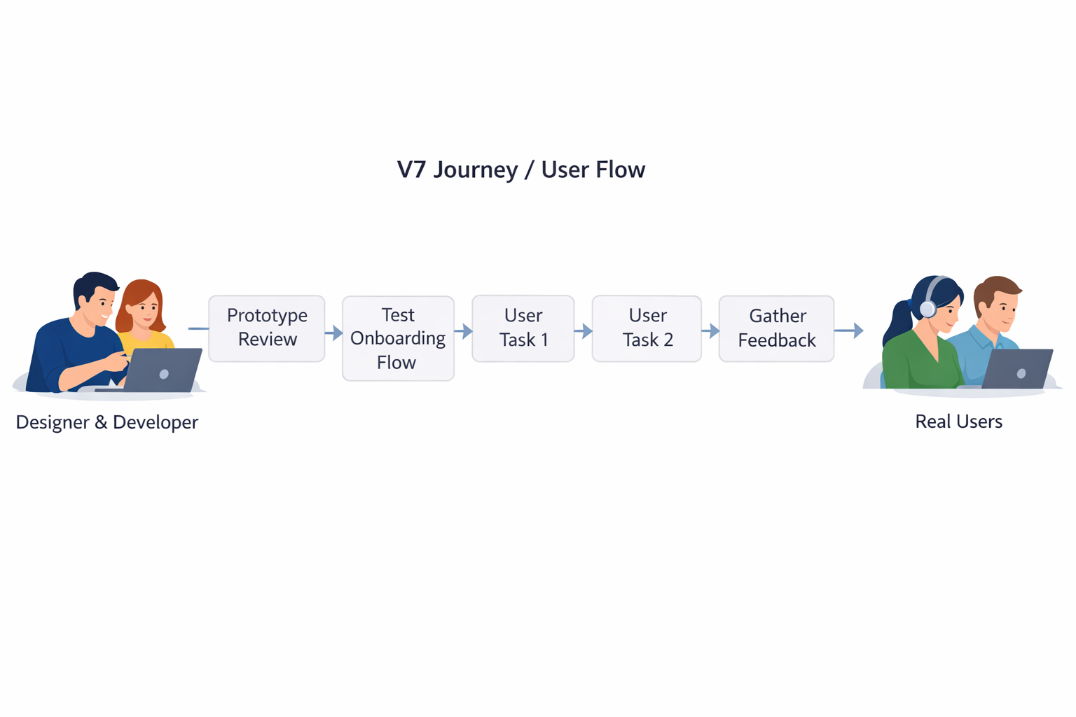
The most important thing is not perfection. It is repeatability. Teams that build a dependable process get better over time because every release becomes both a product improvement and a learning opportunity. That is how UX becomes a durable competitive advantage rather than a one-time design effort.
Conclusion
Modern UX design in 2026 is about building products that are clearer, faster, more trustworthy, and easier to improve. The teams that ship the best products are the ones that start with real user problems, prioritize carefully, validate early, collaborate across functions, and measure the outcomes that actually matter. They do not rely on guesswork or isolated design talent. They build systems for learning and delivery.
The key takeaways are straightforward: UX is now directly tied to trust and speed; research should drive direction; rapid prototypes reduce risk; design systems improve consistency; AI and data-heavy products need transparency; and metrics should reflect real user success. Whether a team is small or enterprise-scale, a repeatable UX process helps everyone move faster with less rework and better results.