
Build a Simple Admin Panel in Vue.js: A Practical Step-by-Step Guide
July 30, 2026
A simple admin panel is one of the most common internal tools in modern web applications. It gives operators, support teams, and product managers a structured place to manage users, review metrics, edit settings, and perform basic CRUD workflows without touching the public-facing application. In practice, a “simple” admin panel is not about minimal capability; it is about clarity. The best admin panels prioritize fast navigation, predictable layouts, readable data tables, straightforward forms, and controlled access to sensitive actions.
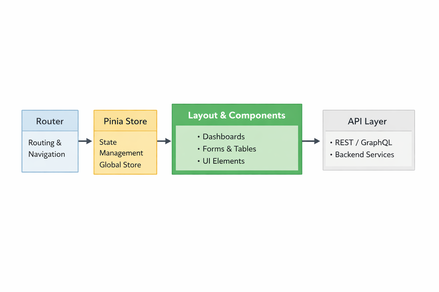
Vue 3 is a strong fit for this kind of interface because it balances productivity, structure, and maintainability. Its component model makes it easy to break a panel into small, reusable pieces such as a sidebar, header, dashboard cards, table modules, and form blocks. Vue Router provides a clean way to organize pages and protect routes, while Pinia gives you a lightweight but powerful way to manage reactive state across the app. Vue Router’s route metadata and navigation guards make it straightforward to enforce access control, and Pinia’s state model is designed to work cleanly with modular stores. Vue 3 also supports the Composition API and <script setup>, which help keep component logic concise and easier to reuse across a growing admin codebase. (router.vuejs.org)
1) Introduction: What a Simple Admin Panel Should Do and Why Vue 3 Is a Strong Fit
A practical admin panel usually covers a small set of operational needs: showing summary metrics, listing records, editing users or content, managing settings, and surfacing system status. In a product environment, those features should be available through an interface that is easy to scan, hard to misuse, and quick to extend. That means the UI should separate navigation from content, show loading and error states clearly, and keep destructive actions visible but deliberate.
For developers, Vue 3 is appealing because it helps you build this kind of app without introducing too much framework overhead. The component system is ideal for dashboards, where repeated patterns are everywhere: metric cards, table rows, filters, modal dialogs, status badges, and side navigation. Vue Router allows the admin shell to map pages like /dashboard, /users, /reports, and /settings to components, and its route meta fields are useful for marking routes as protected or role-gated. The router also supports global and per-route navigation guards, which is exactly what you want for login and authorization checks. (router.vuejs.org)
Vue 3’s Composition API and <script setup> are especially useful in admin panels because UI logic often grows quickly. A table component may need sorting, filtering, pagination, and inline editing. A metrics widget may need polling, chart state, and refresh controls. With <script setup>, you can keep template and logic close together while reducing boilerplate. That keeps the codebase easier to read as the panel expands. For teams that want the smallest possible state surface, Pinia complements this approach by centralizing application data in focused stores rather than scattering it across unrelated components. (pinia.vuejs.org)

2) Project Setup: Create a Vue 3 App, Organize Folders, and Install Core Dependencies
Start by creating a Vue 3 project with a modern build tool such as Vite. The goal is to establish a clean foundation before adding routing, state, and UI concerns. Once the app is created, install the core packages you need for an admin dashboard: Vue Router for page navigation, Pinia for state management, and optionally a utility library for API calls or icons. Keep the dependency list intentionally small at first; admin apps tend to accumulate complexity through features, so the base stack should stay easy to understand.
A typical folder structure might look like this:
src/
  assets/
  components/
    layout/
    ui/
  composables/
  pages/
    DashboardPage.vue
    UsersPage.vue
    SettingsPage.vue
  router/
    index.ts
  stores/
    auth.ts
    users.ts
    dashboard.ts
  services/
    api.ts
  types/
  App.vue
  main.ts
This structure separates concerns in a way that scales. pages contain route-level views, components/layout contains shell elements such as the sidebar and topbar, components/ui contains reusable visual primitives, stores contains domain-specific state, and services contains API abstractions. That kind of separation becomes valuable when the panel grows from a single dashboard to multiple operational tools.
Your main.ts file should register both the router and Pinia before mounting the app. Pinia’s official guidance emphasizes that each application owns its own Pinia instance, and its stores are designed around explicit state definitions. That makes it a good fit for an admin app where predictable state is preferable to scattered local mutations. (pinia.vuejs.org)
A practical setup sequence is:
Create the Vue 3 app.
Add Vue Router.
Add Pinia.
Create a base layout shell.
Wire in placeholder pages.
Connect a typed API service layer.
Add authentication scaffolding before feature work.
That sequence helps you avoid retrofitting architecture later. In admin interfaces, the shell and access model are not optional; they are the backbone of everything else.
3) App Architecture: Choose Composition API and <script setup> for Cleaner Component Structure
For admin panels, the Composition API is usually the better long-term choice because it improves reusability and keeps feature logic grouped by concern rather than by options object sections. A dashboard page may need to fetch stats, manage filters, and watch route changes. With the Composition API, those concerns can be expressed through composables and local reactive state without making the component hard to scan.
The <script setup> syntax is even more helpful because it reduces ceremony. Instead of defining and exporting a component in a separate object, you can write the logic directly in the component file and expose only what the template needs. That is a good match for admin UIs, where many components are mostly presentational but still need a bit of business logic. For example, a UserTable.vue component can import a store, compute filtered rows, and define handlers without a lot of boilerplate.
A strong architecture pattern is to split logic into three layers:
Page components: route-level screens that assemble layout and data.
Feature components: reusable modules like tables, forms, or widgets.
Composables: shared logic such as
usePagination,usePermissions, oruseFetch.
This prevents page components from becoming monolithic. It also makes testing easier because business logic can be extracted into composables or store actions. For an admin panel, that matters because many workflows are stateful: editing a user, saving settings, confirming deletion, or refreshing analytics after a mutation.
Vue Router’s official docs also show that navigation guards can be composed cleanly and that route meta can drive access behavior, which fits naturally with a Composition API codebase. Meanwhile, Pinia’s store model encourages modularity and explicit state, so each domain store can focus on its own feature set. (router.vuejs.org)
A useful rule of thumb is: if logic is only needed by one component, keep it local; if multiple pages or widgets need it, promote it to a composable or store. That keeps your admin panel lean without sacrificing consistency.
4) Routing and Navigation: Set Up Vue Router for Dashboard Pages, Sidebar Links, and Protected Routes
Routing is the backbone of a usable admin panel. Each major task area should map to a route: dashboard, users, reports, settings, audit logs, and so on. Vue Router is designed for exactly this single-page application model, where components are mapped to routes and rendered into a central outlet. For Vue 3 applications, Vue Router 4 is the official router, and it supports nested routes, route metadata, and navigation guards for access control. (router.vuejs.org)
The basic layout pattern is simple: a persistent shell with a sidebar and header, plus a main content area driven by the router. The sidebar uses router-link entries so navigation stays declarative and active states are easy to style. Route names are often better than raw paths for internal navigation because they reduce coupling. For example, the sidebar can link to { name: 'Users' } instead of '/users', which makes route refactors less painful.
Protected routes are especially important in admin panels. Vue Router supports both per-route and global navigation guards, and route meta fields are a clean way to tag protected pages. You can assign meta: { requiresAuth: true, role: 'admin' } to a route and then enforce those requirements in a global beforeEach guard. Vue Router’s docs show this pattern directly: route meta can be inspected in guards, and guards can redirect or cancel navigation based on those conditions. (router.vuejs.org)
A practical routing setup might include:
/login/dashboard/users/users/:id/analytics/settings
Use nested routes when a section has subpages, such as user details or settings tabs. This lets the sidebar stay stable while the main panel changes. For example, /settings/profile and /settings/security can share a parent layout while swapping the inner content.
The guard logic should do three things:
Check whether the user is authenticated.
Verify whether the user has the required role.
Redirect to login or an unauthorized page if needed.
That gives you a predictable access model and keeps unauthorized users out of sensitive sections. Vue Router’s route meta fields are specifically intended for attaching authorization-related metadata, and its navigation guards provide the control flow needed to enforce it. (router.vuejs.org)
5) State Management: Use Pinia for Reactive, Modular Admin Data Such as Users, Metrics, and Settings
Admin panels usually need shared state across multiple pages. Examples include the current user profile, permission flags, dashboard metrics, user lists, and app settings. Pinia is a strong fit because it gives you explicit, modular stores with reactive state, and its state is defined as a function returning the initial state. That design makes the stores predictable and compatible with both client-side and server-side rendering scenarios. Pinia also requires you to declare every state piece upfront so Vue can track it properly. (pinia.vuejs.org)
A useful store layout for an admin app is:
authstore: session, login status, roles, token metadatausersstore: user list, detail record, loading/error flagsdashboardstore: metrics, charts, refresh timestampssettingsstore: application preferences and update status
This modularity helps prevent one giant store from swallowing unrelated features. Instead of a single catch-all state container, each store owns a clear domain. That makes actions and getters easier to reason about. For instance, the users store can expose fetchUsers, createUser, updateUser, and deleteUser, while the dashboard store can manage API refresh intervals and aggregate stats.
In practice, Pinia works well when paired with a thin API service layer. The store should orchestrate state transitions, but the actual HTTP calls should live in a separate api.ts or users.service.ts file. That separation keeps the store testable and helps you avoid coupling state logic to transport details.
A typical flow for a users store is:
Set
loading = true.Call the API.
Store the response in reactive state.
Catch and store errors.
Set
loading = false.
Because Pinia’s state is reactive, all subscribed components update automatically. That means a sidebar badge, a summary card, and a data table can all reflect the same underlying source of truth without prop drilling. Pinia’s official API also supports helpers like storeToRefs, which makes reactive store consumption clean in components. (pinia.vuejs.org)
6) UI Layout Design: Build Header, Sidebar, Content Area, Cards, and Table Sections for the Admin Shell
The admin shell should make navigation obvious and content easy to scan. The standard layout is a left sidebar for primary sections, a top header for global actions, and a main content area for the current page. This pattern works because it reduces decision fatigue: users can immediately see where they are, what they can do next, and how to switch contexts. For admin apps, layout consistency is a feature, not just a visual choice.
Your header can contain the page title, search field, notifications, user avatar, and quick actions. The sidebar should group related areas such as Dashboard, Users, Reports, Logs, and Settings. Use active-state highlighting so users always know where they are. On narrower screens, collapse the sidebar into a drawer or icon-only rail so the interface stays usable on tablets and smaller laptops.
Dashboard content usually starts with summary cards. These cards should answer immediate questions like:
How many active users are there?
What is today’s revenue or request volume?
Are there any open alerts?
Is the system healthy?
Below the cards, place a table or list section for operational data. Tables are especially important in admin tools because many workflows depend on reviewing structured records. Keep rows compact, add status badges, and include obvious row actions like View, Edit, and Delete.
A good shell component hierarchy is:
AppShell.vueMetricCard.vueDataTable.vueEmptyState.vueConfirmDialog.vue
This is a sensible place to introduce design tokens or utility classes so spacing, typography, and color remain consistent. It also helps to define a small set of reusable UI primitives early. Admin panels tend to repeat the same interaction patterns, so a handful of well-made primitives can save a lot of time later.
For example, a stats card should support a title, value, trend indicator, and optional icon. A table section should accept column definitions, row data, loading state, and action slots. These abstractions keep feature pages from becoming visual one-offs and make future scaling easier.
7) Core Admin Features: Implement User Management, Analytics Widgets, Forms, and Basic CRUD Actions
Once the shell exists, the actual admin value comes from feature work. The most common core features are user management, analytics widgets, forms, and CRUD actions. User management usually includes listing users, searching and filtering, editing roles, enabling or disabling accounts, and deleting records with confirmation. Analytics widgets show aggregate data such as signups, sessions, tickets, orders, or system events. Forms handle things like profile settings, organization metadata, or permission assignments.
CRUD operations should be implemented carefully. A simple admin panel does not need a complicated mutation framework, but it does need predictable behavior. For example:
Create: open a modal or dedicated page with validation.
Read: fetch and render a table or detail card.
Update: submit changes, then refresh local state.
Delete: ask for confirmation, then remove the item and update counts.
For user management, the table might include columns such as name, email, role, status, last login, and actions. Status badges can help operators identify accounts at a glance. If the app supports role-based access, the role column becomes especially important because it determines who can view certain sections or trigger certain actions.
Analytics widgets should be lightweight and focused. You do not need a full charting platform to start. A few numerical cards, trend indicators, and small sparkline visualizations can go a long way. The point is to make patterns easy to see, not to crowd the dashboard with noise.
Forms deserve special care in admin panels because they often drive critical configuration. Good form behavior includes inline validation, disabled submit buttons during saves, and clear success/error messaging. If a form updates something sensitive, like permissions or billing details, make the primary action explicit and the consequences visible.
A practical pattern is to keep each feature in its own folder:
features/
  users/
    UserTable.vue
    UserForm.vue
    users.store.ts
    users.service.ts
  dashboard/
    MetricsGrid.vue
    metrics.store.ts
This approach keeps related logic close together and prevents the project from becoming a flat pile of generic components.
8) Data Fetching and Loading States: Connect to APIs, Handle Errors, and Manage Optimistic UI Updates
A real admin panel is only useful when it reflects live data. That means connecting the UI to APIs, managing asynchronous loading states, and showing errors when requests fail. The simplest reliable approach is to keep fetching logic inside stores or composables and let components focus on rendering state. This keeps pages clean and makes retries or refreshes easier to implement.
Every data-driven screen should ideally support at least four UI states:
Loading: show skeletons or spinners.
Loaded: display the table, cards, or form.
Error: show a readable failure message and retry action.
Empty: show guidance when there is no data yet.
This matters because admin users need confidence. A blank table without explanation looks broken, while an explicit empty state tells the user what happened and what to do next.
For optimistic UI updates, update the local store before the server response completes when the action is low-risk and reversible. This is useful for toggles like active/inactive status or some settings changes. If the request fails, roll back the local change and show an error. Optimistic updates make the UI feel responsive, but they should be used only when you can safely recover from failure.
A typical API flow for a user update might look like this:
async function updateUser(id: string, payload: UserUpdate) {
  const previous = users.value.find(u => u.id === id)

  // optimistic update
  patchUserLocally(id, payload)

  try {
    await api.updateUser(id, payload)
  } catch (error) {
    // rollback
    restoreUser(previous)
    setError('Failed to update user')
    throw error
  }
}
That pattern gives you fast feedback while preserving correctness. You should also avoid duplicating request logic inside components. The store should expose high-level actions like fetchUsers, updateUser, and deleteUser, while the component simply calls them and reacts to store state.
For larger apps, consider request deduplication, debounce for search inputs, and pagination for large tables. Those are not required for the first version, but they become important as the panel starts handling real production data.
9) Permissions and UX Basics: Role-Based Access, Responsive Behavior, Accessibility, and Empty States
Even a simple admin panel needs solid permission handling. Role-based access control prevents users from seeing or touching actions they should not have. Vue Router’s route meta fields are a natural place to describe those permissions, and global navigation guards can enforce them at runtime. For example, a route can declare that it requires authentication or a specific role, and the guard can redirect unauthorized users before the page loads. (router.vuejs.org)
Permissions should be enforced in both the UI and the backend. Hiding a button is not security; it is only a convenience. The API must still reject unauthorized mutations. In the frontend, though, it is still worth disabling or hiding irrelevant controls to reduce confusion.
Responsive behavior matters because admin users do not always work on large desktop monitors. The layout should adapt gracefully: the sidebar collapses, tables become horizontally scrollable or stack into card views, and headers wrap cleanly. Think about touch targets too; small icons may work on desktop but become frustrating on smaller screens.
Accessibility should not be an afterthought. Make sure interactive elements are keyboard reachable, form fields have labels, buttons have accessible names, and focus states are visible. Tables should remain readable with semantic markup, and dialogs should trap focus appropriately. Empty states also need accessible text, not just illustrations. If no results are found, explain why and what the user can do next.
Useful UX basics for admin tools include:
Confirmation dialogs for destructive actions
Clear success and error toasts
Disabled states during saves
Consistent button hierarchy
Human-readable timestamps
Helpful placeholders and empty-state copy
These details reduce support burden and make the panel easier to trust. In admin software, trust is a core feature.
10) Deployment and Next Steps: Prepare for Production, Performance Optimization, and Ideas for Scaling the Panel
Before deployment, review the app for production readiness. That includes environment variables, API base URLs, error handling, and build configuration. You should also audit bundle size, because admin panels often grow with charts, tables, and rich form libraries. Keep heavy dependencies out of the initial bundle when possible, and lazy-load pages that are not needed immediately. Vue Router supports route-based code splitting naturally through lazy-loaded components, which is helpful for dashboard sections that users visit less frequently. (router.vuejs.org)
Performance optimization in an admin panel usually focuses on practical issues rather than exotic micro-optimizations. Examples include:
Lazy-loading route pages
Debouncing search inputs
Paginating large tables
Virtualizing long lists when needed
Avoiding unnecessary re-renders with well-scoped reactive state
Pinia stores can help here because they keep state modular and visible. If one feature becomes expensive, you can optimize that store or page without rewriting the whole application. Vue’s component model also makes it easy to isolate expensive sections and load them only when required.
For production deployment, make sure you:
Configure secure authentication flows
Store secrets in environment variables
Set proper caching headers where appropriate
Use HTTPS
Monitor client-side errors
Log failed API actions in a way operators can review
As the panel grows, scaling usually means adding more domains rather than making one screen more complex. Good next steps include audit logs, advanced filters, export tools, bulk actions, multi-step forms, and chart-driven analytics. If the panel becomes larger, consider introducing a design system, typed API contracts, and shared validation rules so the project remains consistent over time.
Conclusion
A simple admin panel in Vue 3 becomes powerful when it is structured around a clear shell, route-based navigation, modular stores, and predictable data flow. Vue Router gives you a clean page model and protected routes, Pinia gives you reactive shared state, and the Composition API with <script setup> keeps your components focused and maintainable. With a thoughtful layout, good loading and error states, and baseline permission handling, you can build an admin interface that is practical today and scalable tomorrow. (router.vuejs.org)
Key takeaways:
Keep the admin shell simple and consistent.
Use Vue Router for page structure and access control.
Use Pinia for modular state, not one giant store.
Design for loading, empty, and error states from day one.
Enforce permissions in both the UI and the backend.
Optimize for maintainability first, then add advanced features as needed.