
Accessible brand systems in 2026: how to design logos that scale everywhere
June 6, 2026
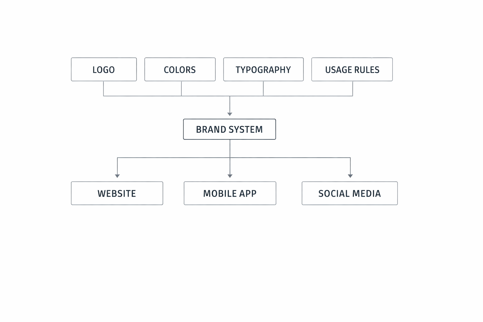
Brand identity in tech used to revolve around a single hero asset: the logo. In 2026, that idea is too small for the job. Products live across websites, mobile apps, embedded surfaces, sales decks, marketplaces, social feeds, partner listings, onboarding emails, and AI-assisted interfaces. A logo still matters, but it now acts more like the front door to a much larger system of rules, components, and behaviors. Good brand systems make a company recognizable even when the full logo is reduced to an app icon, converted to dark mode, or embedded inside a product UI. They also need to respect accessibility requirements, since contrast, legibility, and interface adaptability affect whether people can actually perceive and trust the brand. WCAG 2.2 sets a 4.5:1 contrast minimum for normal text and 3:1 for large text, while also noting that text in logos and brand names has no contrast requirement—an important distinction, but not an excuse to ignore usability. (w3.org)
For fast-growing teams, the challenge is no longer “Can we make a nice logo?” It is “Can we build a brand system that stays coherent when dozens of people use it across dozens of channels?” Apple’s guidance on branding and dark mode, Microsoft’s brand governance, Shopify’s centralized brand assets, and Figma’s advice on naming and documentation all point in the same direction: scalable identity comes from rules, not just assets. (developer.apple.com)
1. The new role of brand identity in tech: why a logo alone is no longer enough
A logo still does important work: it gives people a mental shortcut, a sign of authorship, and a visual anchor. But in modern tech, a logo is only one expression of a broader identity. Users experience your brand through product loading states, empty screens, buttons, app icons, notification badges, onboarding flows, support content, social assets, and even the tone of microcopy. Apple’s branding guidance explicitly recommends that branding defer to content, which is a useful mindset for product-led teams: identity should support the experience, not overwhelm it. Microsoft likewise treats brand assets as a controlled set of proprietary elements, not as free-floating decoration. (developer.apple.com)
This matters because tech brands are no longer consumed in a single context. A buyer might first see a tiny logo in a marketplace listing, then a product screenshot on LinkedIn, then a help article, then a sales presentation, and finally the app interface itself. Each moment adds to or subtracts from trust. If the identity system is inconsistent, the brand feels fragmented; if it is overdesigned, the product feels heavy. The best systems aim for a recognizable core that can flex without drifting. Atlassian describes its design system as spanning tokens, components, accessibility, and more, which reflects how brand expression increasingly lives inside design infrastructure. (atlassian.design)
Another reason the logo-alone model fails is that accessibility is now a baseline expectation. WCAG 2.2 gives teams a formal standard for contrast and text resizing, and Apple’s accessibility guidance reminds teams to check minimum contrast in both light and dark appearances. In practice, that means your visual identity must work not just in a brand book but in actual interface conditions: small, dynamic, layered, and frequently personalized by the user. (w3.org)
The takeaway: in 2026, the logo is the signature, not the whole identity. The system around it is what makes the signature legible across the real world.
2. Start with the system, not the symbol: defining brand rules that scale across web, product, social, and sales
The easiest way to create a brittle brand is to start with a mark before defining the rules around it. A more scalable approach begins with the system: what stays fixed, what can vary, who can change it, and where it must never change. This includes logo lockups, clear space, minimum sizes, color rules, typography, icon style, illustration style, motion behavior, and usage permissions. Figma’s design system guidance emphasizes documentation and naming conventions as core parts of the system, because documentation is what makes decisions repeatable instead of tribal knowledge. (help.figma.com)
A system-first approach is especially useful when a brand needs to live across multiple channels. Social posts need more expressive templates. Sales decks need more room for messaging. Product UIs need restraint and clarity. Marketplaces often have strict asset requirements and sometimes demand monochrome or simplified variants. Shopify’s brand-assets workflow is a strong example of centralizing brand elements so they can be reused consistently across channels, while still allowing some market-specific exceptions when necessary. (help.shopify.com)
A practical system should define three layers:
Foundation rules
These are the non-negotiables: primary logo, approved alternate marks, color palette, typography, spacing, and contrast thresholds. WCAG 2.2 contrast guidance should be used here as a baseline for text and interface elements, even if logo text itself is exempt. (w3.org)
Channel rules
Different channels need different treatments. For example, the same brand might use the full wordmark on the website header, a condensed icon in product chrome, and a simplified social avatar. Apple notes that branding should defer to content, which supports adapting the expression to the environment rather than forcing one rigid layout everywhere. (developer.apple.com)
Ownership rules
Who may export, edit, localize, or approve brand assets? Microsoft’s trademark and brand guidance shows the importance of controlling use of brand assets, while Figma’s naming and documentation guidance shows how systems become easier to operate when ownership is clear. (microsoft.com)
The best logo systems are not “more creative.” They are more explicit. They reduce ambiguity so every team can make brand-safe decisions quickly.
3. Color with purpose: choosing palettes that preserve recognition while meeting accessibility contrast expectations
Color is one of the strongest brand-recognition tools, but it is also one of the easiest to misuse. A palette that looks great in a presentation may fail the moment it appears on a white card, in dark mode, on an outdoor screen, or inside a dense dashboard. Accessibility guidance from W3C makes the core requirement clear: normal text should meet 4.5:1 contrast, large text 3:1, and developers should use WCAG 2.2 as the reference standard for accessible web content. Apple adds a platform-specific reminder that dark interfaces often need greater perceptual contrast and should be tested in both light and dark appearances. (w3.org)
For brand teams, this means color should be designed as a system of roles, not as a list of favorite hex values. A good palette usually includes:
Primary brand color
Secondary or support colors
Neutral surfaces
Text colors
Data-viz or accent colors
State colors for success, warning, error, and info
The important distinction is between identity color and functional color. Identity color helps people recognize you. Functional color helps them use the product. If those two roles conflict, usability should win. That is why many strong systems define semantic tokens such as brand, surface, text, and border instead of directly wiring UI to a single brand swatch. SAP’s design token guidance is a useful example of naming tokens by function and meaning so teams can scale them consistently. (sap.com)
Contrast testing should happen early, not after launch. Test the palette in these combinations:
brand color on white
brand color on black
text on tinted surfaces
hover and disabled states
charts and alerts
dark mode and high-contrast contexts
The goal is not to flatten the brand into safe beige. It is to preserve recognition while making sure the identity survives real interface conditions. Shopify’s brand asset guidance also shows a practical fallback pattern: when full-color logos are not an option, use the monotone version with the most contrast. That is a useful rule for product teams that need visual consistency without sacrificing legibility. (shopify.com)

4. Small-size reality check: designing marks, wordmarks, and icons that remain legible in tiny digital spaces
Tiny digital spaces are where many brand systems break down. A logo that looks elegant on a homepage may become unreadable at 24 pixels, blur into a favicon, or collapse into an indistinct shape in a mobile tab bar. This is why small-size testing should be part of logo design from the start, not a final QA step. Microsoft’s Fluent iconography guidance is instructive here: icons are meant to be familiar, consistent, and shape-based, and they should not be used in place of the Microsoft logo. That separation between logo and iconography is a healthy reminder that not every small mark can carry the same job. (fluent2.microsoft.design)
For tiny contexts, a brand system usually needs multiple levels of simplification:
Full logo: for headers, presentations, and formal contexts
Compact wordmark: for medium-width spaces
Symbol or monogram: for avatars, app icons, and favicons
Micro-mark: for extreme constraints, if absolutely needed
When simplifying, the most common mistake is trying to preserve every detail. At small sizes, detail does not equal quality; it often equals noise. The mark should prioritize silhouette, negative space, and instantly recognizable proportions. If the wordmark collapses, consider custom spacing, optical corrections, and a version with fewer intricate joins or internal cutouts.
Testing should happen in context, not just in isolation. A good small-size test set includes:
16, 24, 32, and 48 pixel sizes
light and dark backgrounds
favicon and browser tab usage
social avatar crops
mobile navigation bars
notification badges and splash screens
This is where accessibility and brand consistency overlap. A tiny mark that is visually “on brand” but impossible to distinguish is not working. WCAG’s rule on resizing text, along with the distinction that logos are exempt from text contrast requirements, should not lull teams into complacency. The user still needs to perceive and identify the mark. (w3.org)
A good rule of thumb: if you cannot recognize the brand at a glance in a constrained size, the mark needs a smaller, more focused variant.
5. Variations without chaos: how to build approved logo families for sub-brands, product lines, and campaigns
As companies grow, one logo usually becomes several. You get product lines, enterprise tiers, regional editions, partner versions, event marks, and campaign-specific lockups. Without structure, this quickly turns into visual chaos. The solution is not banning variation; it is defining an approved logo family with clear boundaries. IBM’s brand and design language materials are a good example of master-brand architecture supporting multiple expressions under a coherent system. (ibm.com)
A healthy logo family typically includes:
Master brand mark
Product or suite lockups
Sub-brand endorsements
Campaign versions
Event or conference versions
Partner co-branding variants
The key is to define when each variation is allowed and what parts can never change. For example, the symbol may remain fixed while the descriptor changes. Or the logotype may stay intact while a product label is added in a standardized position. What you want to avoid is every team inventing a new arrangement when they need a campaign asset.
Governance matters here. Microsoft’s brand asset policy shows how seriously major organizations treat trademark integrity, and Figma’s brand usage guidance similarly emphasizes proper use of marks to protect brand identity. (microsoft.com)
A practical rule set for variations:
Define the master mark first.
Create only as many approved variants as you can document and maintain.
Use consistent spacing, alignment, and hierarchy rules.
Specify where each version may be used.
Require review for any deviation.
This is especially important for campaigns and product launches. Short-term marketing needs can tempt teams into making “temporary” versions that later become permanent but undocumented. Over time, those exceptions erode recall. A well-managed family gives teams freedom inside a controlled design language, so the identity can stretch without snapping.
6. Brand governance for fast-growing teams: who can use what, and how to prevent visual drift
Brand drift usually does not begin with malice. It begins with convenience. Someone needs a social image by noon, a partner needs a logo file, a sales team needs a one-pager, and suddenly the company has six slightly different versions of the same mark. Governance is the system that prevents this from becoming the norm. Centralized asset management, clear permissions, and good documentation are essential. Shopify explicitly notes that centralizing brand assets helps ensure consistency across channels and saves time, which is exactly the operational benefit teams are trying to capture. (help.shopify.com)
Good governance answers a few basic questions:
Where is the source of truth?
Which files are approved for external use?
Who can export, edit, or localize them?
What requires brand review?
How are exceptions tracked?
Microsoft’s trademark guidance underscores the legal dimension: brand assets are proprietary and should not be used casually or modified in ways that imply endorsement or dilute identity. Figma’s organization and naming guidance adds the operational layer: clear naming and consistent structure make assets easier to find and swap correctly. (microsoft.com)
A strong governance model often includes:
A brand owner or steward
A design system maintainer
A legal/trademark reviewer for external uses
A marketing operations contact
A lightweight request process for new variants
You do not need bureaucracy to have governance. You need clarity. For example, a team might allow internal presentations to use approved brand assets directly, but require design review for public-facing collateral, partner kits, and new campaign marks. That reduces friction while protecting the brand where it matters most.
The fastest way to prevent drift is to make the right path the easiest path. If the approved SVG, PNG, and dark-mode assets are easy to find, well named, and documented, people will use them. If not, they will improvise.
7. Motion, dark mode, and responsive layouts: adapting a brand for modern interfaces without losing consistency
Modern branding is no longer static. Logos animate, interfaces collapse and expand, theme preferences change, and brand expression must adapt to responsive layouts. Motion can make a brand feel alive, but only if it is restrained and repeatable. Apple’s dark mode guidance is a strong reminder that appearance is dynamic and must respect system context, while its branding guidance reinforces that content should remain primary. In practice, that means animation should support recognition, not distract from function. (developer.apple.com)
Dark mode deserves special treatment because it changes perceived contrast, visual weight, and even brand color intensity. Apple advises designing separate interface icons for light and dark appearances if necessary, and its dark mode documentation recommends system background colors and higher perceptual contrast in dark contexts. That matters for logos too: a mark that looks balanced on white may feel too bright or too thin on black. (developer.apple.com)
Responsive branding means defining breakpoints for identity, not just for layout. Ask:
At what width does the full wordmark become too cramped?
When should the symbol replace the wordmark?
Should the mark move above or beside the headline?
Which decorative treatments disappear on small screens?
What happens in narrow mobile headers?
Motion also needs a brand language. If the UI uses easing, scale, or reveal effects, those patterns should be documented so that product teams do not invent incompatible animations. Atlassian’s recent discussion of its design system emphasizes brand as an opinionated design language with foundations spanning motion and accessibility, which reflects where the industry is headed. (atlassian.com)
The best approach is to define motion tokens or motion rules in the same spirit as color and typography tokens:
Entry animation duration
Exit animation duration
Easing curves
Use cases for the logo animation
Reduced-motion fallback behavior
Consistency does not mean every screen looks identical. It means the user can tell the interface belongs to the same company, even as it adapts to context.
8. Practical examples of a brand asset library: files, naming conventions, usage notes, and handoff workflows
A strong brand system is only useful if people can actually find and use it. That is why the asset library matters as much as the logo itself. A practical library should include the right file formats, clear naming, usage notes, and a simple handoff workflow that connects brand, design, product, and marketing. Figma’s guidance on naming components and using slash-separated conventions is relevant here because the same logic applies to brand assets: consistent names make libraries searchable and reduce mistakes. (help.figma.com)
A useful asset library usually includes:
Core files
SVG for scalable vector use
PNG for quick export and legacy workflows
PDF for print and legal review
Source files for controlled editing
Favicon and app icon bundles
Dark-mode variants
Monochrome variants
Social avatars and cover templates
Naming conventions
Use a predictable naming pattern, for example:
brand-logo-primary-horizontal.svgbrand-logo-primary-stacked.svgbrand-mark-monochrome-white.svgbrand-icon-app-512.pngbrand-logo-darkmode-horizontal.svg
The point is not elegance; it is legibility. SAP’s token naming approach and Figma’s organization guidance both show that names should encode meaning and usage, not just aesthetics. (sap.com)
Usage notes
Each asset should include:
Approved background colors
Minimum size
Clear space rule
Do-not-use examples
When to choose this variant
Accessibility notes for contrast or dark mode
Handoff workflow
A reliable handoff process might look like this:
Brand team publishes approved assets.
Design system owner mirrors them into the shared library.
Product and marketing teams consume only approved variants.
Changes are versioned and announced.
Deprecated files are archived, not deleted.
Shopify’s centralized brand-assets model is a useful real-world example of how centralization reduces fragmentation across channels. The same principle applies whether you are managing one startup or a portfolio of products. (help.shopify.com)
9. Measuring brand performance: signals that show whether your identity is helping trust, recall, and conversion
Design teams often talk about brand performance as if it were purely subjective. It is not. While some aspects of identity are emotional, there are still measurable signals that show whether the system is helping or hurting the business. A well-designed brand system should improve recognition, reduce confusion, and support conversion by making the experience feel trustworthy and coherent. Shopify’s emphasis on centralized brand assets points to operational consistency, but the real question is whether that consistency translates into business impact. (help.shopify.com)
Useful signals include:
Trust and credibility
Lower bounce rates on landing pages
Higher completion rates on signup or checkout flows
Improved engagement on branded content
Fewer support questions about “is this the real app/company?”
Recall and recognition
Brand lift studies
Direct traffic growth
Better ad recall
Faster identification in usability tests
Higher recognition in social thumbnails and app marketplaces
Conversion and efficiency
Better click-through on sales collateral
Higher conversion from branded campaigns
Less time spent recreating assets
Fewer review cycles due to inconsistent usage
Accessibility and usability
Fewer contrast-related issues
Better legibility in dark mode
Higher success rates in small-size tests
More consistent performance across devices and themes
W3C’s contrast guidance and Apple’s dark mode recommendations make it clear that accessibility can and should be evaluated directly, not assumed. If a brand color repeatedly fails contrast in real interfaces, that is not just a compliance issue; it is a brand performance issue. (w3.org)
For meaningful measurement, compare before and after a refresh. If you launch a new system, track changes in:
asset adoption
design review time
marketing turnaround time
key funnel metrics
brand consistency across touchpoints
A brand system is working when it makes the company easier to recognize, easier to trust, and easier to use.
10. A checklist for launching or refreshing a tech brand system in 2026
Launching a brand system is much easier when the work is broken into clear steps. The goal is to align strategy, design, accessibility, and operations before everyone starts producing assets at scale. Here is a practical checklist for 2026:
Strategy and structure
Define the brand architecture: master brand, sub-brands, products, and campaigns.
Decide which logo forms are approved: full, stacked, icon, wordmark, monochrome.
Write the core identity rules: clear space, minimum size, and prohibited uses.
Assign ownership for approvals and exceptions.
Accessibility and contrast
Test all core colors against WCAG 2.2 contrast expectations. (w3.org)
Check text and brand elements in light and dark mode. (developer.apple.com)
Verify legibility at small sizes and on low-resolution displays.
Include reduced-motion alternatives where motion is used.
Asset production
Export SVG, PNG, PDF, and app-icon variants.
Create dark-mode and monochrome versions.
Produce social, web, sales, and product templates.
Build a naming convention that is consistent and searchable. (help.figma.com)
Governance and documentation
Publish a single source of truth.
Document usage rules for every asset.
Define who can request new variants.
Set an archive process for deprecated assets. (microsoft.com)
Rollout and measurement
Train marketing, product, and sales teams.
Update templates, libraries, and CMS assets.
Audit live surfaces for drift.
Track trust, recall, and conversion signals after launch.
A good checklist is not just a launch tool; it is a maintenance tool. Brand systems decay when nobody owns them, when documentation is vague, or when “temporary” exceptions become permanent. The checklist keeps the system honest.
Conclusion
In 2026, accessible brand systems are not a luxury layer on top of design. They are the foundation that allows a company to stay recognizable across products, channels, and devices without sacrificing usability. The strongest systems start with rules, not symbols; use color with purpose; protect small-size legibility; and provide clear governance so teams can move quickly without creating visual drift. WCAG contrast expectations, platform guidance on dark mode, and practical design-system discipline all point toward the same outcome: a brand that is both distinctive and usable. (w3.org)
The most effective tech brands are not the loudest or most elaborate. They are the ones that remain coherent when scaled down to a tiny icon, stretched across a campaign, or embedded inside a product interface. If your logo can do that, your brand is no longer just a mark. It is a system.